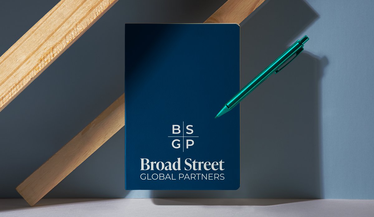
Broad Street Global Partners
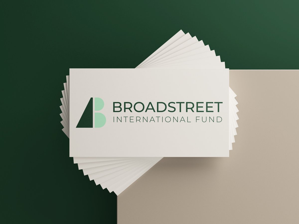
+ Broadstreet International Fund
Visual Identity
Situation
An existing client, Broadstreet Global Fund, approached us to create identities for two sister companies. While the names shared a close relationship, the brands needed to feel clearly distinct for legal and regulatory reasons.
Strategy
We centered the work around the idea of “main street, not wall street” and the company’s emphasis on investing in physical spaces and local communities. The goal was to create identities that felt credible and established without leaning into the cold, generic language common in finance branding.
Implementation
I developed multiple visual directions for each company, exploring how typography, color, and structure could differentiate the brands while still feeling connected. The final systems balanced sophistication with a more grounded, community-focused tone.
Outcome
The identities helped position both organizations as thoughtful, professional investment groups with a genuine connection to the communities they serve. The work gave each company a clear presence while maintaining cohesion across the broader brand family.