United Community
Brand Campaign
Art Direction and Design
Situation
Following a recent rebrand, United Community entered markets where awareness of the company was still relatively low. On top of that, there was internal concern that removing the word “bank” from the name could create confusion about who they were and what they offered.
Strategy
We leaned into the company’s strongest differentiator: a deeply people-focused approach backed by years of recognition for customer service and trust. The campaign paired human-centered messaging with direct, confident financial language to clearly establish credibility and category recognition.
Implementation
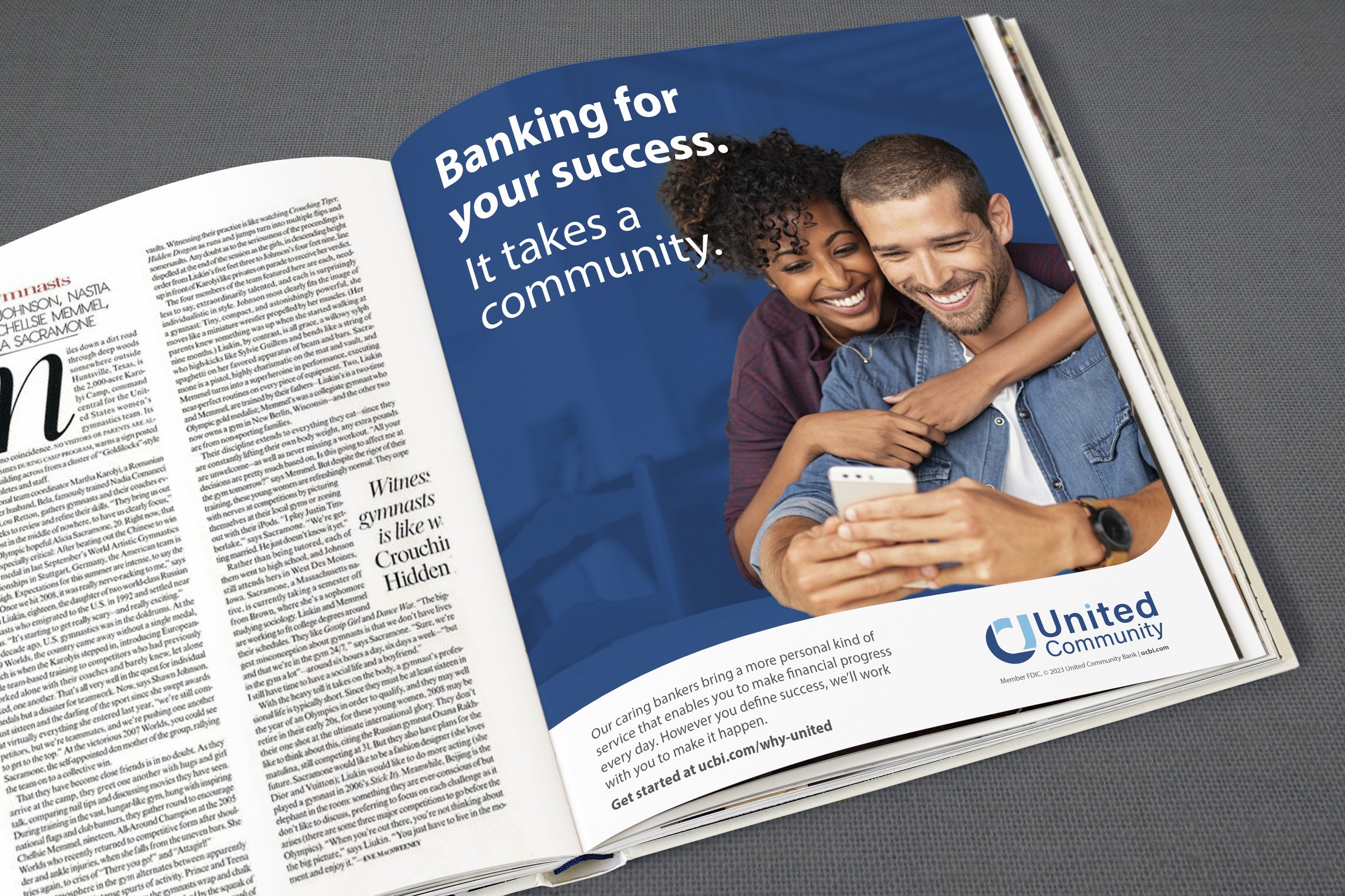
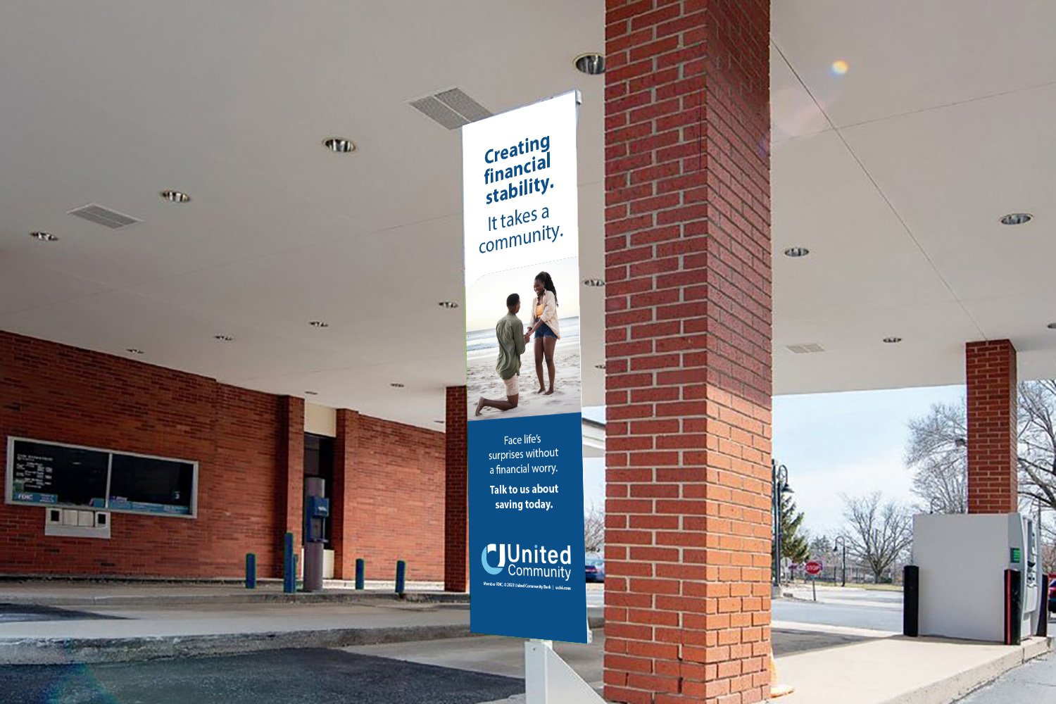
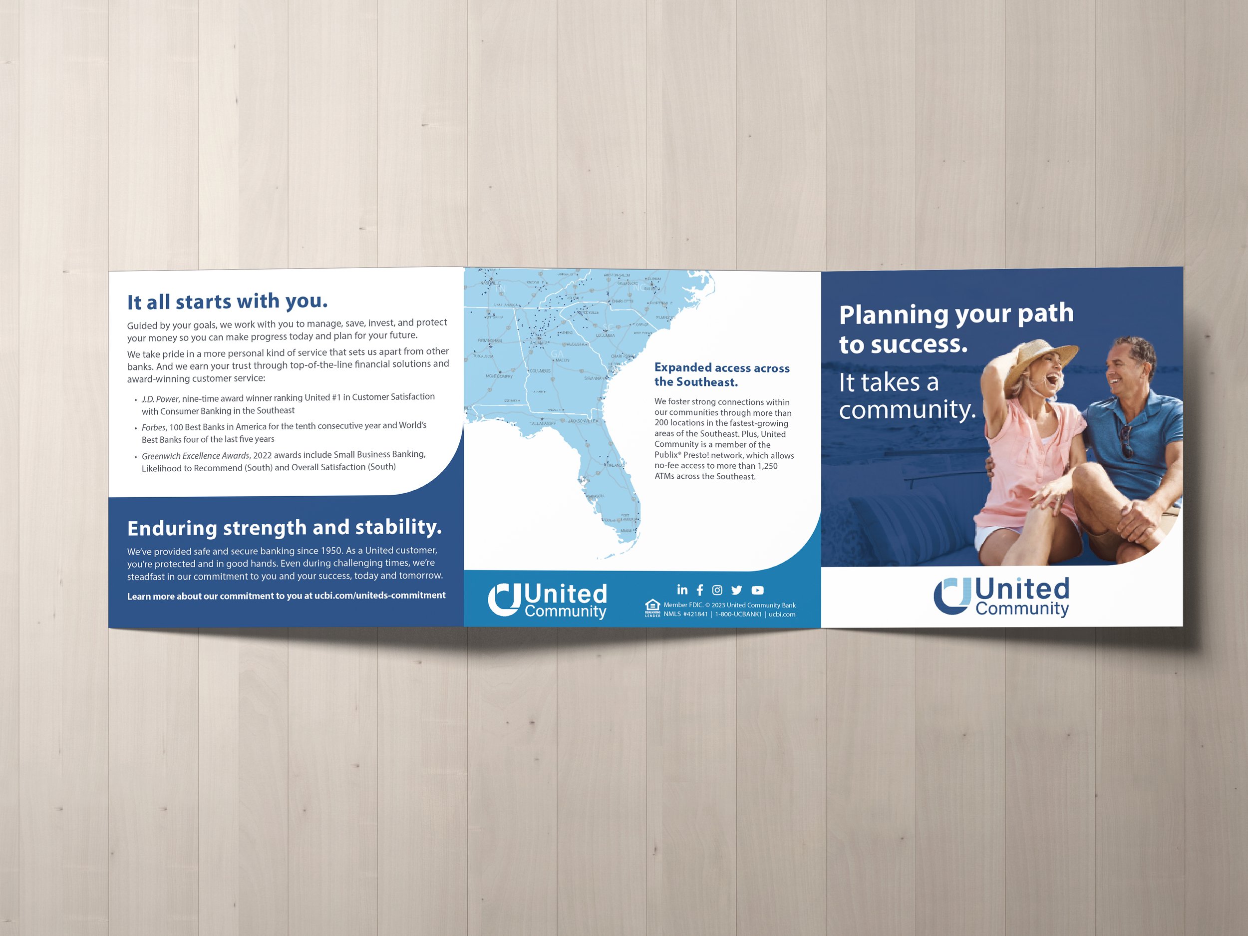
We developed bold headline systems that made the banking message unmistakable while giving the brand a more modern and recognizable voice. Visually, we expanded the use of brand color within photography and existing assets to create a more distinct and ownable look across campaign materials.
Outcome
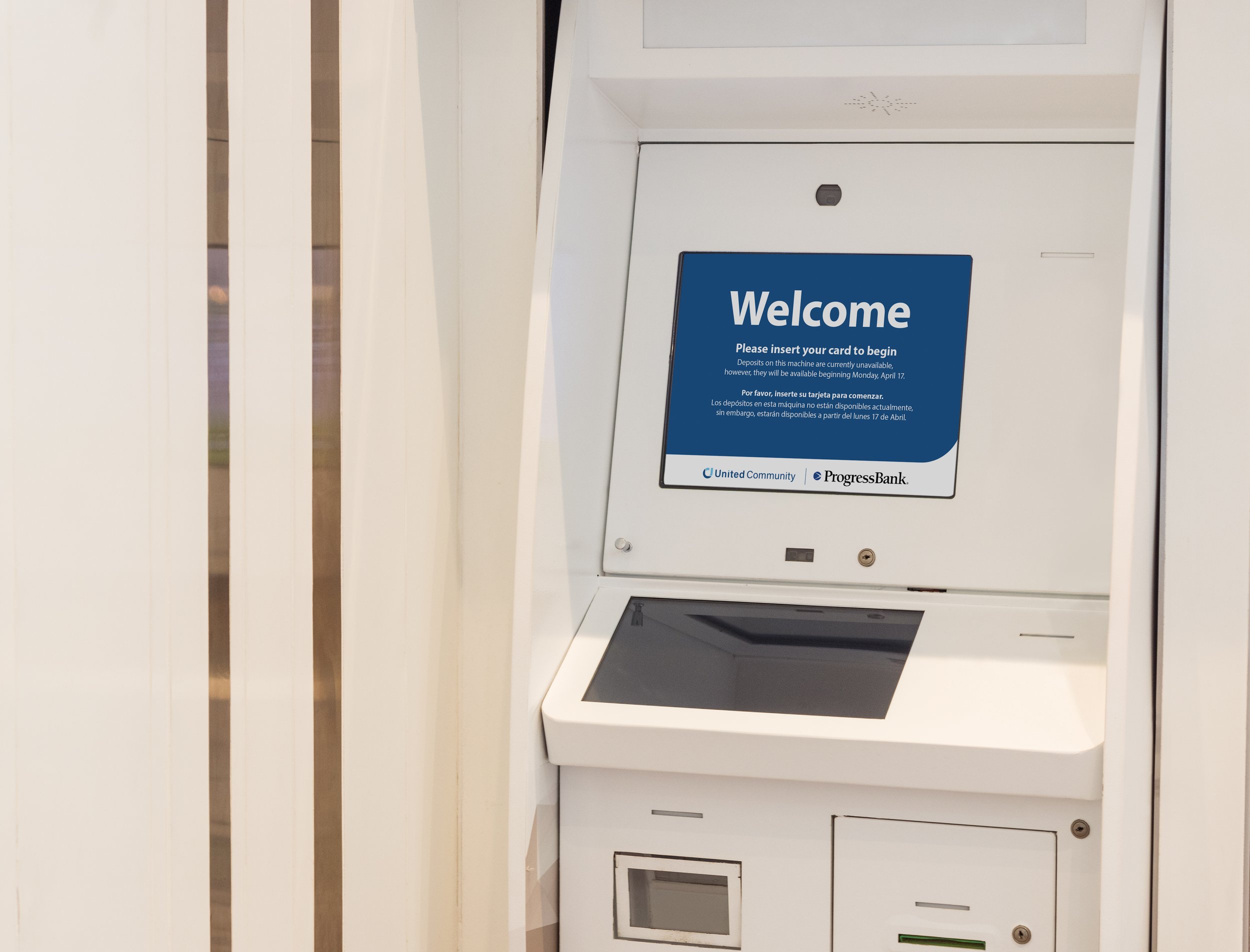
The campaign helped United Community show up with greater clarity and confidence in new markets while reinforcing the trust-centered reputation the company had already built. It also gave the rebrand a more recognizable and cohesive visual presence across channels.